We create brands and a better future with you!
Explore our projects and activities and see how we can make a difference together!
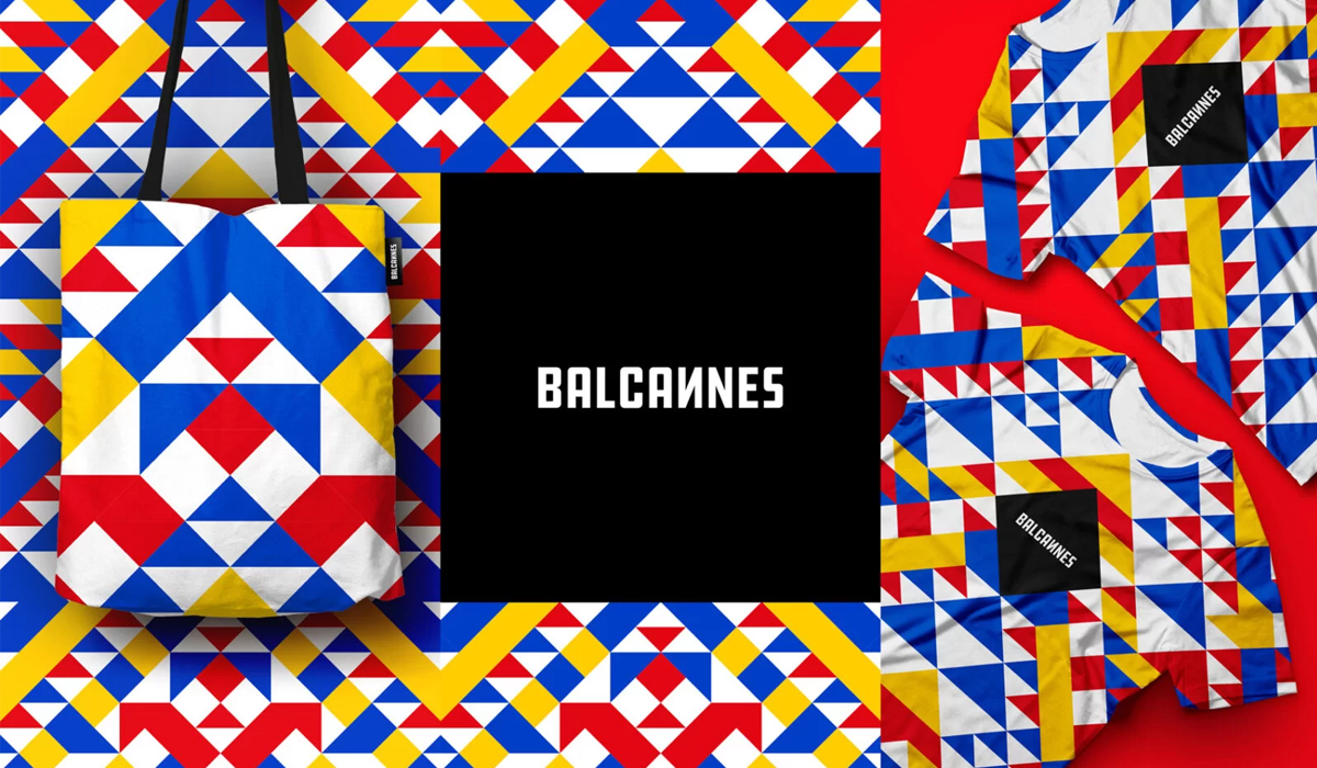
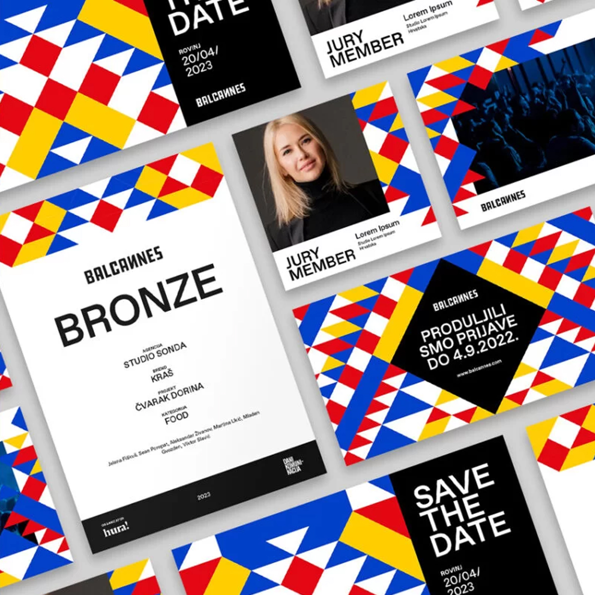
The idea behind the visual identity stems from the very name of the competition, that is from the term Balkans, and aims to highlight the strength that the mentioned countries have when they act together in depicting the region in terms of market communication throughout Europe and worldwide.
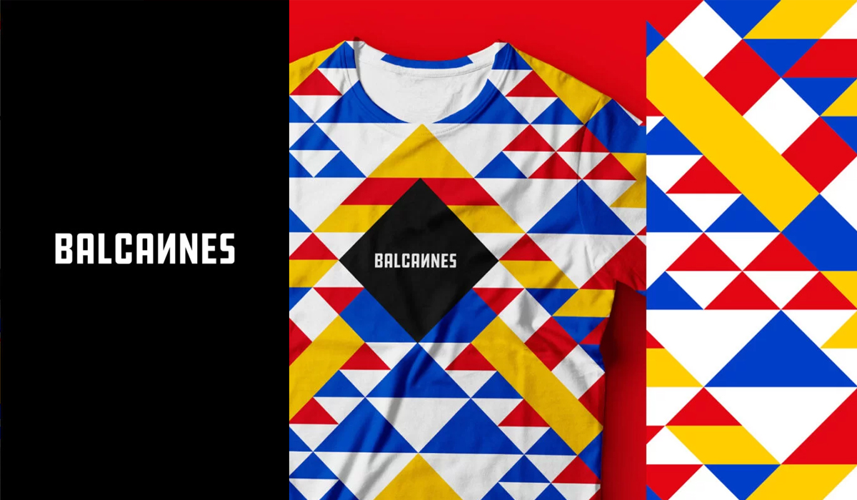
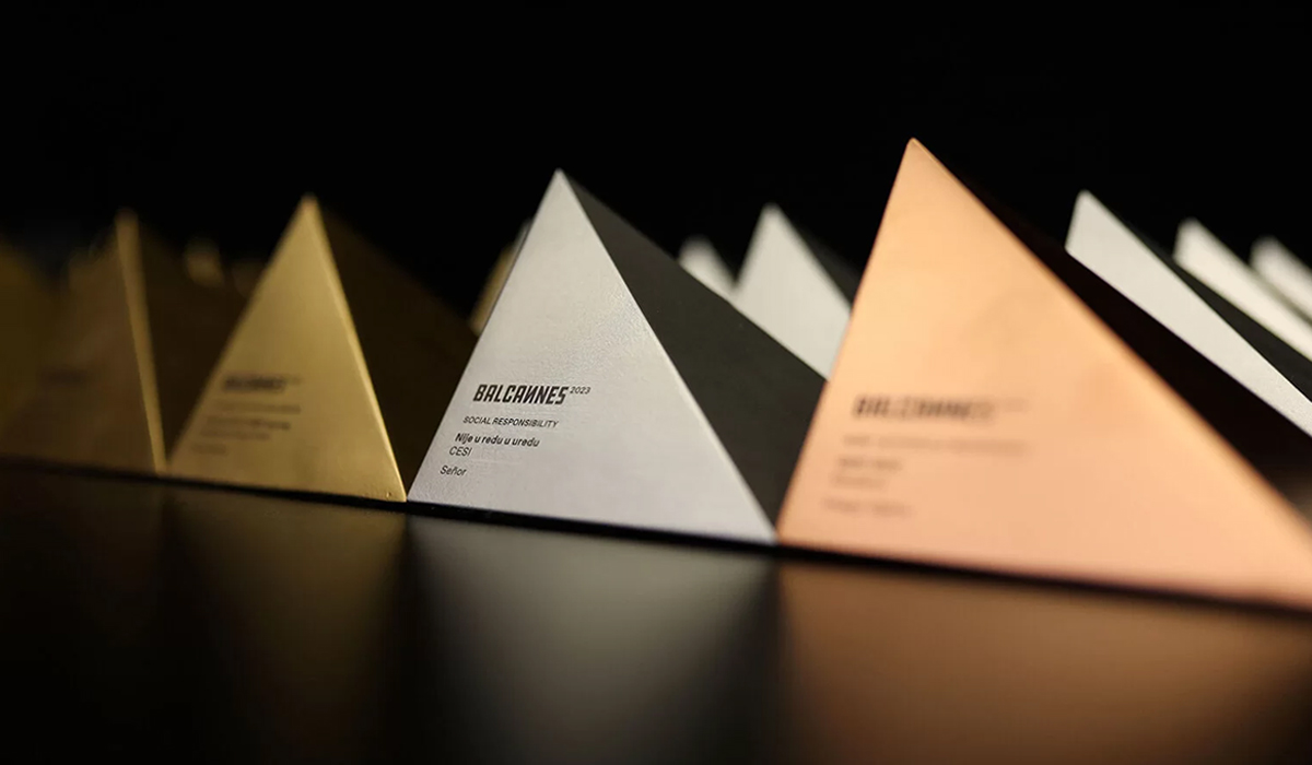
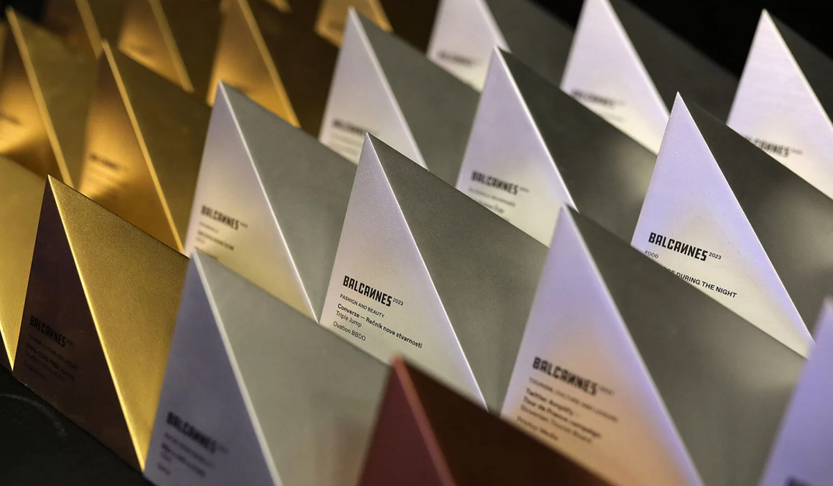
In order to maintain the association with the geographical area of the Balkans (that is the name for the mountain chain that stretches through the region), the main graphic building element used in the visual identity and design of the award is exactly the symbol of the top of the mountain, a triangle.
It is placed in a way that symbolizes progress and striving towards the top. Different elements are not mutually exclusive, they rather coexist, and the colors are those of the national flags of the participating countries.
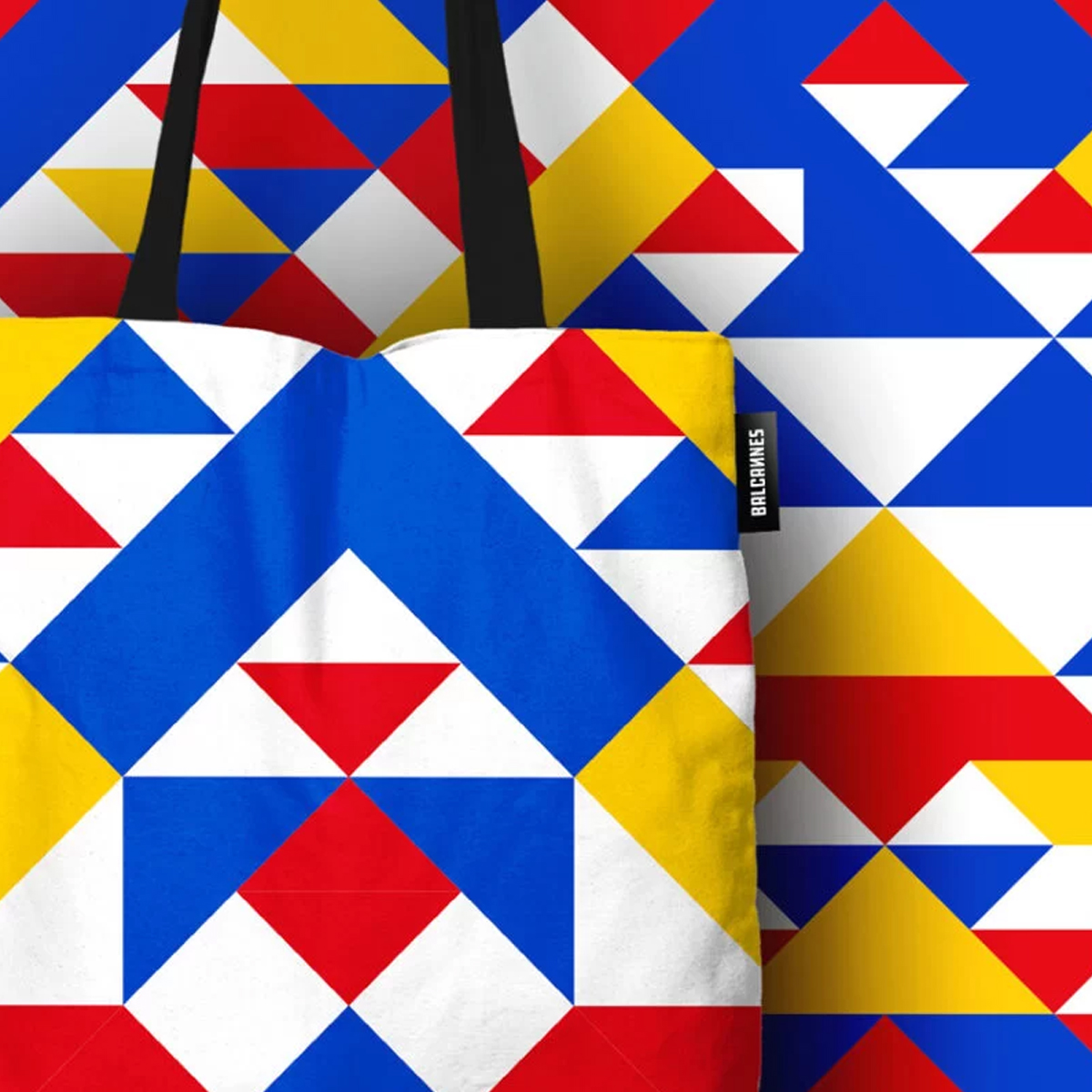
Lining up and combining colored triangles create a dynamic play of characters
which is widely applicable to the identity needs.
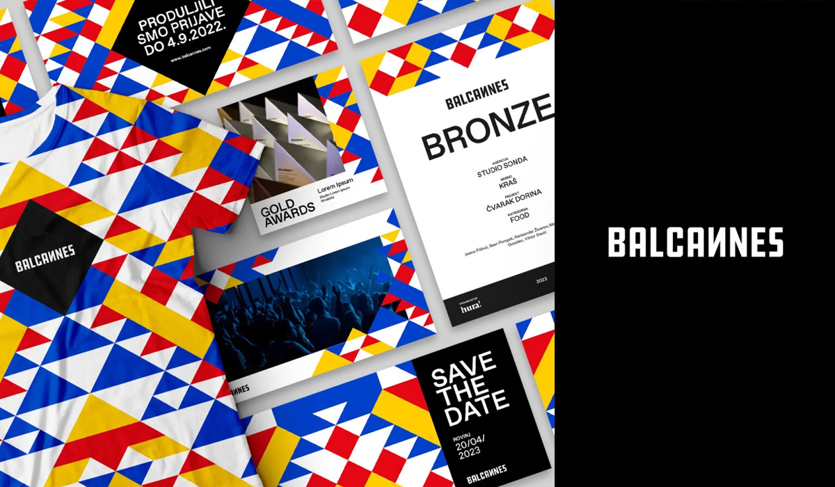
The BalCannes award itself, through the design of the object, sublimates everything that is embodied in the idea of the concept, from the top of the Balkans as a starting point, to the symbolism of reaching those same peaks through the highest quality creative works in the region.
So we believe that it will be nice to see it exposed on the shelves of the regional creatives.
Jelena Fiškuš, Sean Poropat (Creative directors, Studio Sonda)
Martina Ukić (Senior designer, Studio Sonda)
Mladen Gvozden (Account manager, Studio Sonda)
Jelena Babić (Production manager)
Emica Elveđi (Photos of the award)
Explore our projects and activities and see how we can make a difference together!