We create brands and a better future with you!
Explore our projects and activities and see how we can make a difference together!


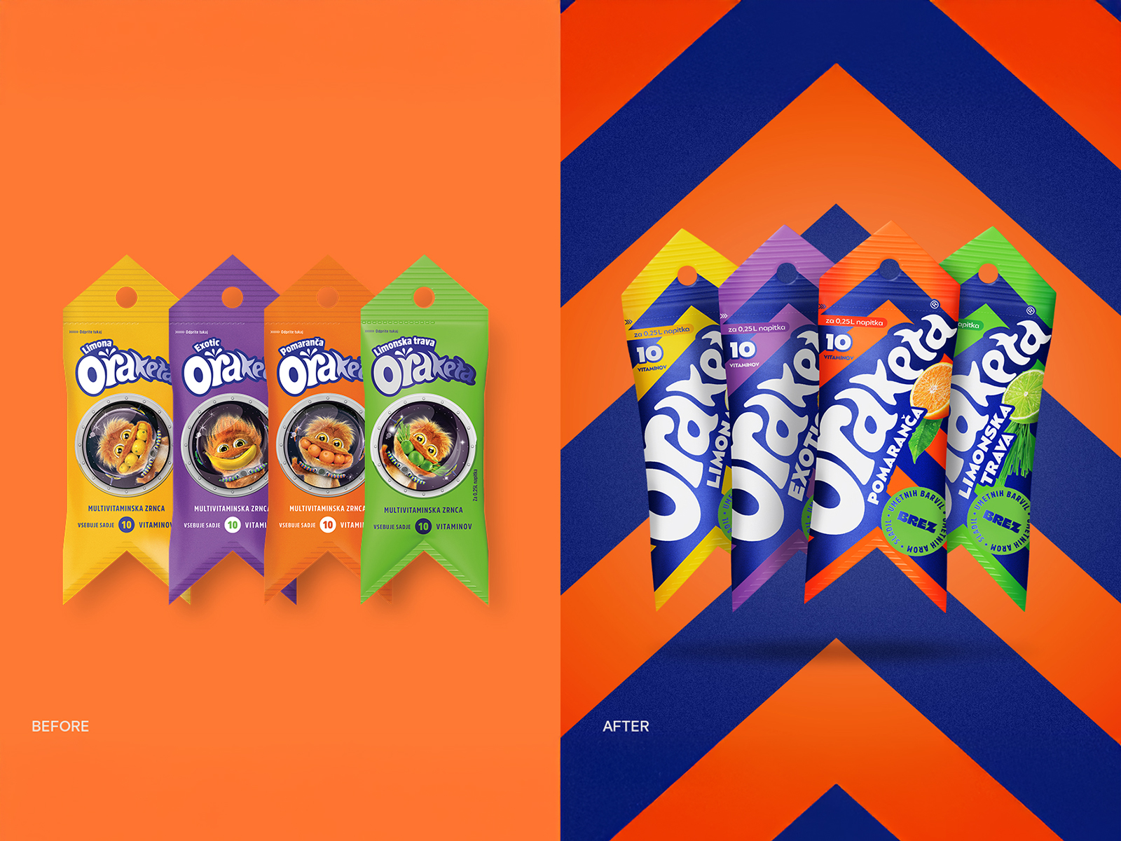
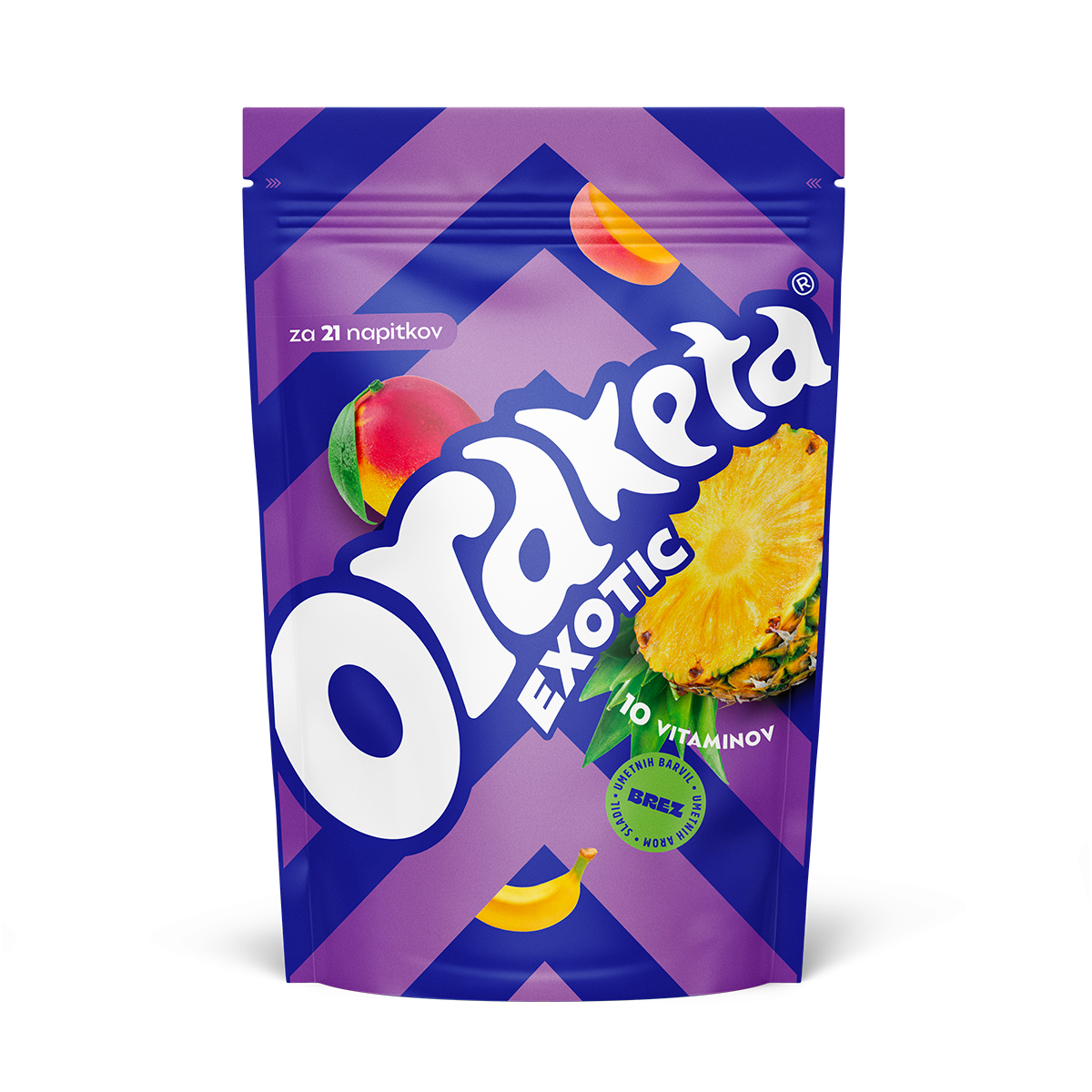
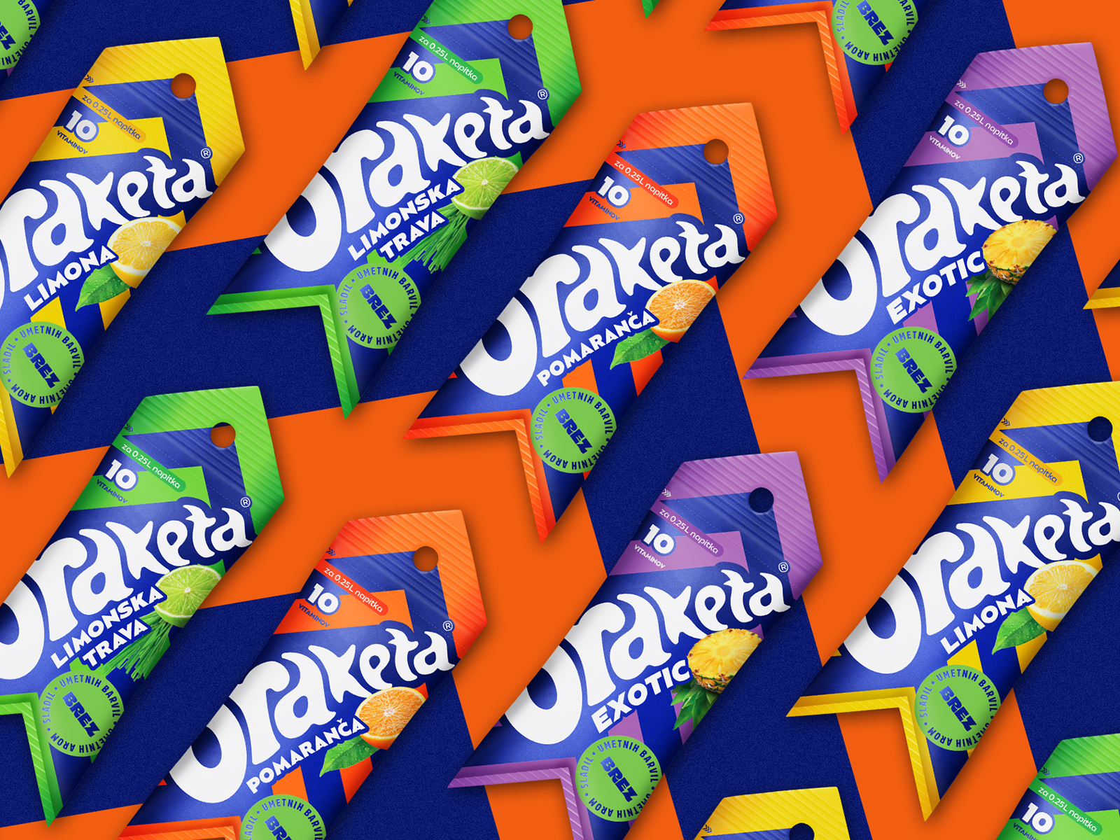
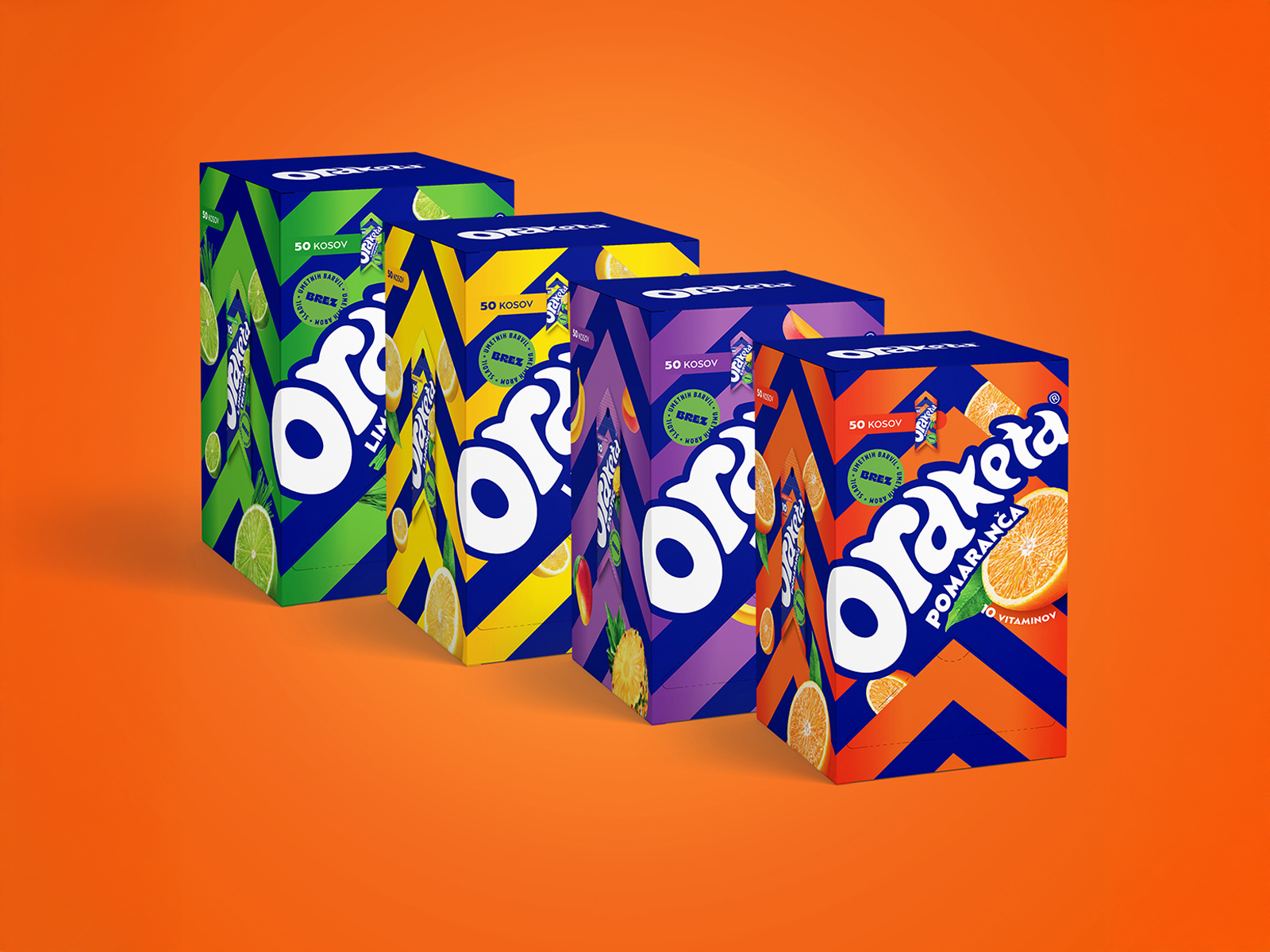
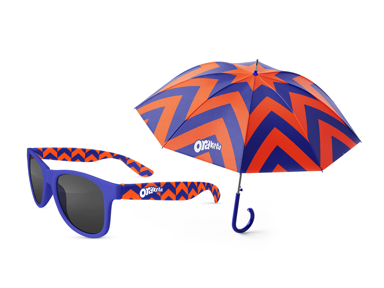
Redesigned packaging for Oraketa, highlighting energy, movement, and vibrant fruit visuals
In the Slovenian market since 2020, this brand of Radenska managed, in just a few years, to gain its market share within the category of multivitamin drinks and increase recognition among consumers. The new packaging design aims to stand out more significantly in the category and on the shelves but remains aligned with the defined settings of this fun brand with an inspiring name – Oraketa.
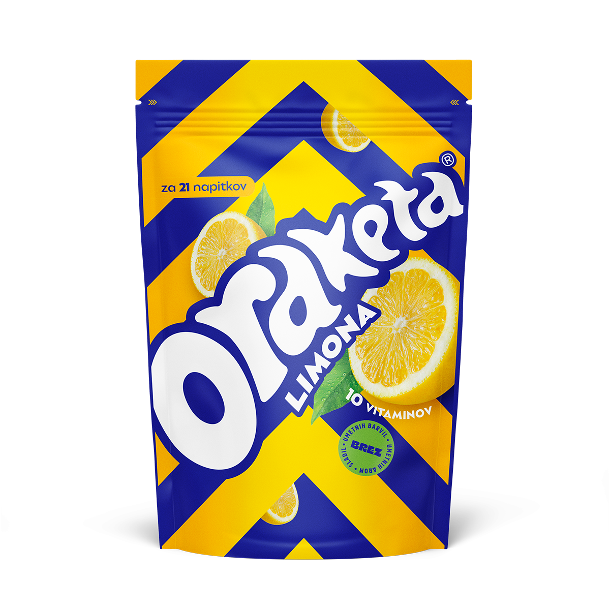
It does not contain artificial colors, sweeteners, and aromas.
The emphasis is therefore on displaying activity, energy, and movement.
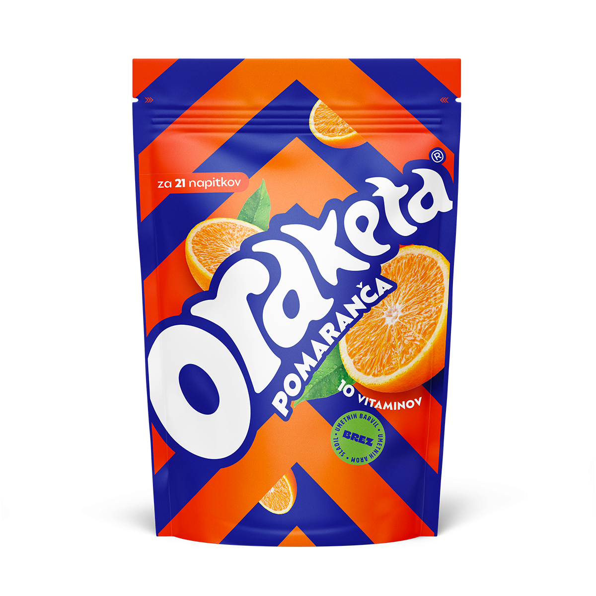
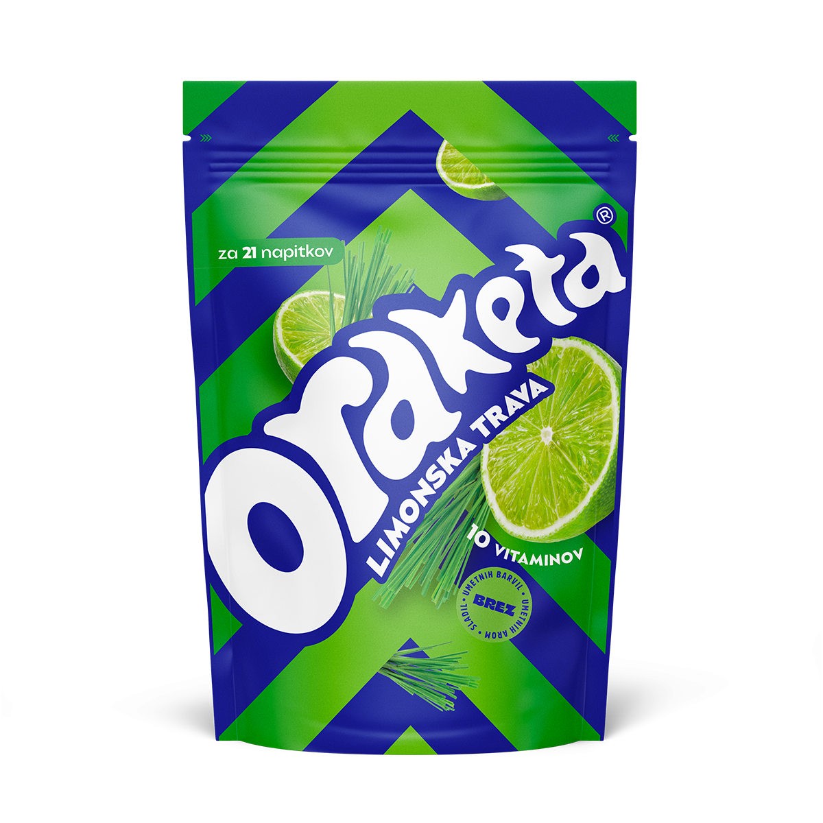
Which is achieved by the dynamics of graphic lines and interaction of colors.
While the flavors themselves are communicated through attractive images of fruit.
The design has been applied to several packaging formats, including the 19 g package found in the HoReCa offer, which in its very form resembles a rocket.
The task was to make Oraketa more visible on shelfs comparing to the leading competitor, but still to be consistent regarding brand’s attributes that need to communicate fun, fruit ingredients and the connection with the name Oraketa (rockett). Additional task was not to make a product too “childish”, as it is aimed for a wider target group.
The emphasis was
on displaying activity,
”rocket” energy
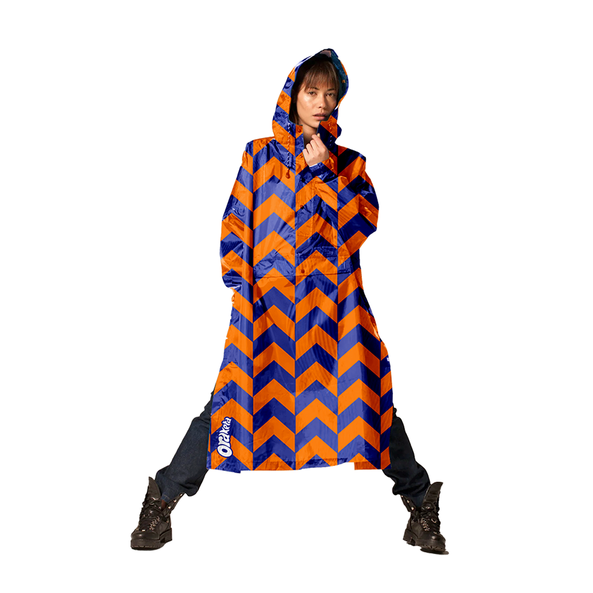
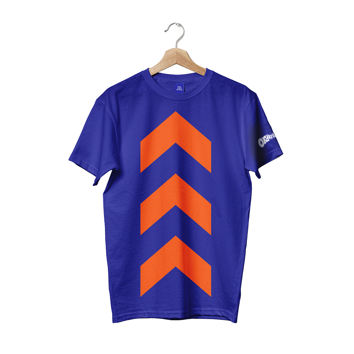
and movement.
Results (2024 Vs 2023):
Retail (volume, 400g) +31%, (value 400g) +55%
Horeca (volume 19g sachets) +10%, (value sachets) +8%
79% research participants rated the rebranding and new design positively.
90% research participants stated that the product is well differentiated from competitors
Creative direction and design: Jelena Fiškuš, Sean Poropat
Design: Aleksandar Živanov, Sanda Maričić
Account director: Mladen Gvozden
Explore our projects and activities and see how we can make a difference together!